Wednesday, August 14, 2013

Evolutionary

For the past few days I have been solely focused on creating a new UI (User Interface) system for Pathogen. The goal is to create something aesthetically pleasing, unified and easy to navigate.

UI 101
Windows XP

But before we can get into the nitty-gritty, some of you may not know what I'm talking about. So lets look at some examples. These images on the right are all everyday UI systems.

So I guess a definition of a UI system is that it is: An organizational structure that allows the user to navigate from one element to another.

Creating UI
Star Wars DVD

So how do you go about trying to create a UI system?

The first thing we do is ask what does the screen needs to be able to service. If you look at the Star Wars DVD example it services four functions:

1. Play Movie: Allow the user to player the film
2. Chapters: Allow the user to "fast forward" their content
3. Options: Allow the user to access handy utilities like Languages & subtitles
Sketch_01
4. Special Features: Allow the user to view additional material about the film.

So we do the same thing, list out what the Main screen of Pathogen needs to handle:

1. Campaign: Access the Campaign/single player mode.
2. Online Play: Access the Online Hub
3. Local Play: Navigate to Game Setup
4. Map Editor: Access the editor
5. Map Browser: Access the online workshop of user created maps
Sketch_02
6. Game Center: Allow users to login/out & check achievements
7. Options: Utility for managing sound & credits.

Once we list out everything we know that a screen needs to handle its time to start creating mock-ups. I begin simply on paper, sketching out how the screens could layout. From there we translate the sketches into a mock'ed up version of what it could look like on device.

In general we try a bunch of different designs to see what works, what doesn't & evolve from there.


The Results
After several hours and without too much bloodshed we decided on this design.

It worked for several reasons:

1. Its familiar.
2. Simple to navigate
3. non-obtrusive.
4. This standard worked well across a wide variety of additional screens *this was key.


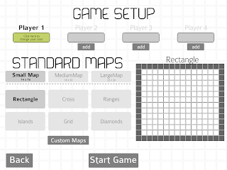
 The Game Setup screen has been a thorn in our side for a long while. It must convey an incredible amount of information, while remaining easy to navigate.

The new standard allows the Game Setup screen to mimic a online-check out process. This familiar interface will help easy new players into the game.


Why change?

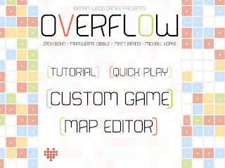
 Our old menu, while interestingly unique, was flawed. It could only hold three elements and maintain our concerns for ease of navigation and a pleasing aesthetic

As we added more elements (online, map browser, etc) the visual space got crowded and it became harder to navigate. This design was also so unique that we could not incorporate its design into any of our other screens such as the Game Setup.

Our original Game Setup menu crammed all of the necessary information into a single screen. Which meant that advanced user could change any element of play quickly.

However we found that our new users had trouble navigating it and we we often asked, How do i change my player color?

Often if a user made a mistake they would exit the screen entirely and then re-enter so they could be prompted for their selections.

 History

But this wasn't our first rodeo. The UI in Pathogen has evolved several times. Here is a look back on Pathogen's development as told through the UI.

March 2013
March 2013
January 2013
January 2013
December 2012
December 2012

November 2012
November 2012


Monday, August 12, 2013

Heavy Duty

Warmer than I thought it was going to be when I looked out the window this morning.

Matt is back! Time to buckle down and get to work. Boston FIG is roughly a month from today & we could be potentially launching two months from now.

Sat down this morning and had a good company meeting about general stuff as well as Pathogen's development. From that we identified the most important aspects that deserve our time and how to split them up. UI design is my life for the next few weeks as we decided on how we want to unify everything, while Matt is headed towards the dream of ranked online games.

On the social side of things, we bought our domain for Pathogen which will have its own little site that we push people towards. Mike is going to be stepping up our twitter/facebook campaign to help garner interest.

Listening To: As if to Prove a Point by Grouse
Reading: Double Dexter by Jeff Lindsey
Watching: Nikita

Friday, August 9, 2013

Rain rain go away...


 Come Again another day...

UI design today, or at least this morning for a little while. Pathogen currently suffers from inconsistent UI. Every screen is laid out in a different way and I really want to unify it. This was sparked when Marguerite and I started talking about the beginning of the online hub.

That is going to potentially be a pretty large change.

On the positive side, yesterday I did get the game to port out to iPhone4 successfully. Which was very cool. Ran a little slow, but that is because its importing in assets meant for the iPad & scaling them down (rather expensive). We could conceivably take our current assets and scale everything down to the size they need to be on the ipad and load those in instead.

Went to UVM this morning as well to speak to a bunch of kids at a Tech camp who are learning Ruby/HTML. We spoke about game development, showed them Pathogen & a brief glimpse at Flash. We came in to basically tell them that the skills they are developing can easily be used to create games especially with their current coding experience.

Still a little worried about performance when someone plays for an extended period of time in the campaign. The game appears to slow down & I cannot figure out why.... Not having a 64 bit system (for Scout) & using Flash Builder 4.6 is not helping either.

Thursday, August 8, 2013

The Mountain just got a little bigger.

Stormy morning without any rain, hopefully it won't on my way home.

Yesterday we took a field trip down to Concord NH to meet with our publishing contact. Roughly half way for both of us and we ended up eating at a nice play on the Concord Boardwalk, neat little town. Kinda strangely laid out, but warmer down there than in Vermont.

We had a great conversation about the future of Pathogen. Now we have plenty to get done, oh boy.

Lots of planning this morning about the nature and scope of Online. Thank you Starcraft/Bnet for being a great role model in what we need to accomplish. Tomorrow will be UI design day so we can get off and running with it next week when Matt gets back.

I am working on trying to get the game to deploy to iPhone 4s, a brand new challenge I had avoided confronting for a very long time. Thankfully it's very easy to deploy to thanks to Flash Builder and the efficiency work I did in the past might make this possible.

Boston FIG seems to be THE moment for us. Its going to be so huge... and there are so many other good developers there. Oh boy, so much to do.

Wednesday, August 7, 2013

Navigation

Getting fallish here, cool enough for jeans.

Been on a roll with Pathogen, starting to look very professional/polished with those animations finally in & working. Stabilized the build this morning and planning on pushing to Test-Flight here in a few.

Matt grabbed the animation changes and rolled with them, updating the Online portion of things as well which is awesome. 

Apple build is the focus for the end of the week, maybe sooner. Really need to play through the campaign again the ensure everything is ok.

Meeting with our publishing contact tonight to touch base and start charting the course further down-stream. Boston FIG is looking to be our spotlight and we are trying to think/account for everything.

Monday, August 5, 2013

Flash lost some points last week...

Ah ha! After a very long week I finally found the root of our issue when exporting from Flash.

Flash has trouble creating a 1 to 1 conversion into Bitmap if the exported Movieclip has any Filters on it. If a filter exists, such as BLUR or GLOW the effect does not translate well from Vector into Pixels, they end up taking up more space per pixel than vector does.

Here is a visual demonstration. 
This is the exported image from Flash. Note that 1. it is a lot bigger, 2. that it is not centered.These are two important factors in game development.

Size costs. The larger an asset is the more space it takes up on our sprite sheets. The more sprite sheets we have the slower the game runes.

The center point is very valuable in Pathogens case because so many of our animations are rotated to services all of our possible animation needs. If an asset is centered its much easier to identify the center point via code. center point == object.width/2 & object.height/2.

So how did we end up with the bottom result?

Well, we turned to a third party program called Kurst which captures the data of a .SWF and prints them out as PNG's. Its basically like taking a screen shot of every frame of the animation while its playing.

Animations are finally looking good in engine as a result. Sibyl is giving the rest of the colors to me today, had her only export out Green so I could figure out the issues, so by the end of the week we should have a build that is all good to go.

Friday, August 2, 2013

Ugg

Biked home in the rain yesterday & its threatening to do so again later today.

Its been a nightmare of code/art for the past two days as I attempt to get these new assets in. The ultimate goal is to switch between multiple animations without any of the popping issues you experience currently in Pathogen.

This has become far harder than first imagined. Assets are not exporting correctly, pivot points are offset and the result is not even close to what I'm looking for.

I think the ultimate answer is to flip the table and just re-write the whole animation system...